Link
Links are used as navigational elements. They may appear on their own, within a sentence or paragraph, or directly following the content.
Overview
Links are used as navigational elements and can be used on their own or inline with text. They provide a lightweight option for navigation but like other interactive elements, too many links will clutter a page and make it difficult for users to identify their next steps. This is especially true for inline links, which should be used sparingly.
When to use
Use links when you want users to:
- Navigate to a different page within the application
- Navigate to an entirely different site
- Jump to an element on the same page
- Link to emails or phone numbers
When not to use
Use a button instead of a link for actions that will change data or manipulate how it is displayed, change a state, or trigger an action. Buttons should never be used for navigational actions.
Variants
| Variant | Usage |
|---|---|
| Standalone | These links are the default link variant. They are used on their own or directly following content and they do not use underlines. They can be paired with an icon. |
| Inline | Inline links are used within a sentence or paragraph and are styled with an underline. They should not be paired with an icon. |
Live demo
This live demo contains only a preview of functionality and styles available for this component. View the full demo on Storybook for additional information such as its version, controls, and API documentation.
Formatting
Anatomy

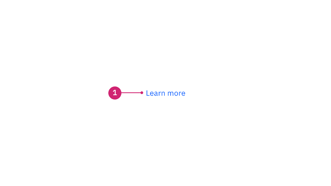
- Label: Communicates what is being linked to.
Sizing
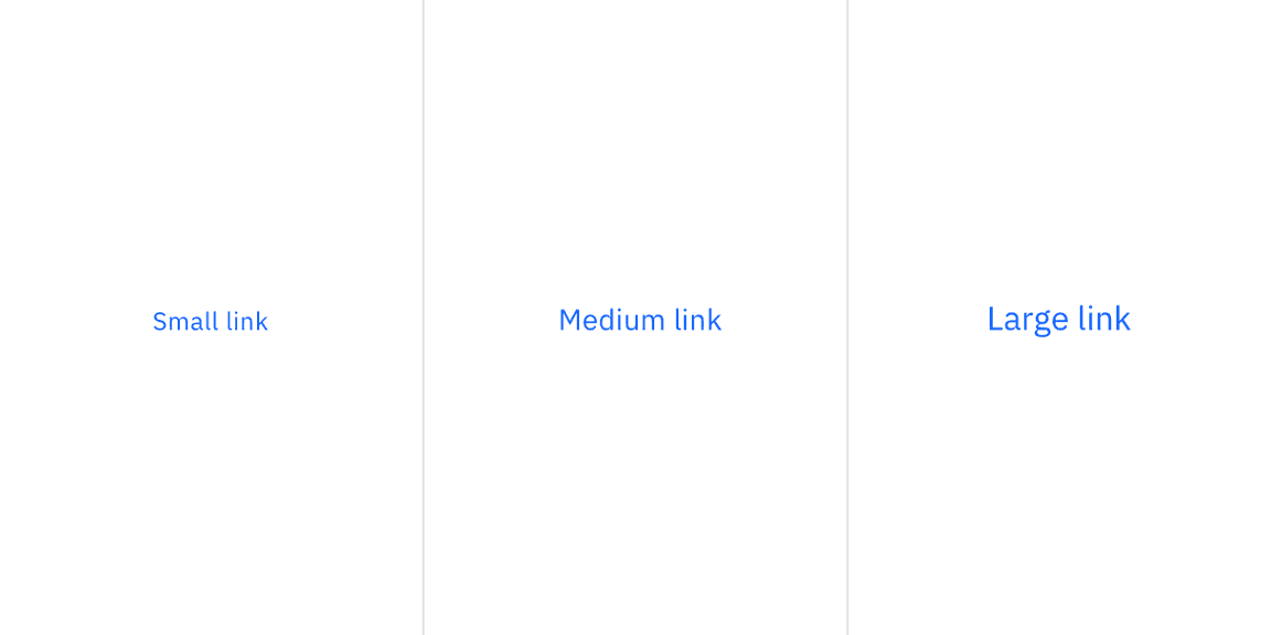
There are three size variants for the link component: small, medium, and large. The link size should match the type size of the text it is inline with. When using links apart from other content, the link size should match the default body copy size of the page.

Content
We recommend links be three words or fewer. Because links take users to a new location, it is important that their labels accurately reflect the content users will find at the link destination. Use meaningful labels for links and avoid terms like “click here” or the web address itself.
Links need to be clear enough to be understood by the user, but should not be so long that the text wraps unless used inline.
For further content guidance, see IBM Accessibility on link purpose.
Behaviors
Interactions
Mouse
Users can open a link by clicking anywhere along the link text or on the associated icon.
Keyboard
Users can open a link by pressing Enter while the link has focus. For
additional keyboard interactions, see the Accessibility tab.
Screen readers
VoiceOver: Users can open a link by pressing Control-Option-Space or Enter.
JAWS: Users can open a link by pressing Enter.
NVDA: Users can open a link by pressing Enter.
For additional information, see screen reader tests.
Link variants
Standalone link
Standalone links are used on their own directly following content. They should not be used within sentences or paragraphs. Standalone links are the default link style for Carbon and only have an underline in the hover state.
The standalone link component can be paired with an icon. Use 16px icons and place them to the right of the link. Icons should always be the same color as the link text.
Inline link
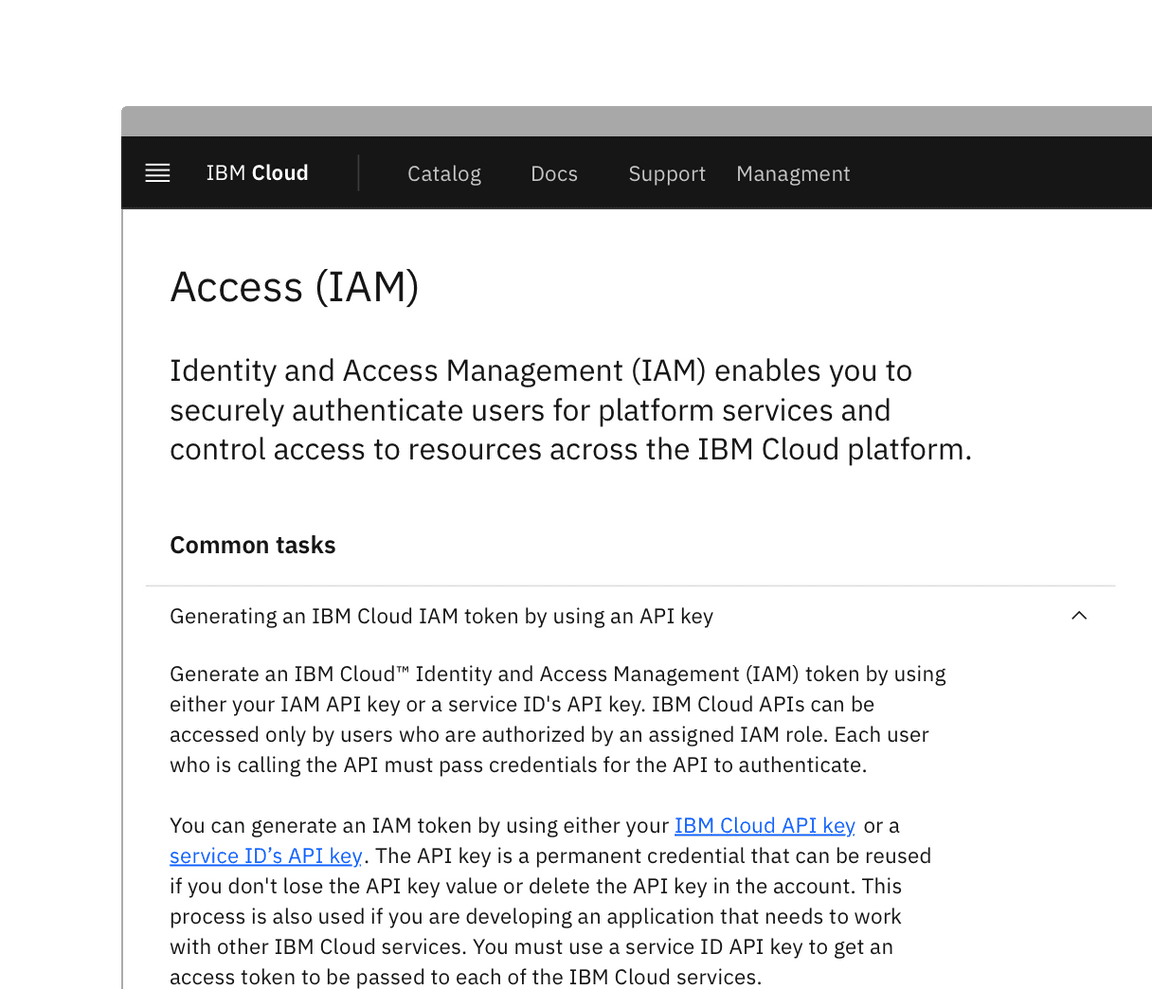
Inline links are used in sentences or paragraphs of text. The inline link behaves the same as the standalone link but it is styled with an underline. This helps differentiate them from the text they are placed next to and makes it clear users can interact with them.
Inline links should not be used on their own and should not be paired with icons.

Modifiers
Visited style
By default, the link component does not use a visited style. Visited links indicate that a user has already opened the link so they can be a helpful indicator during task completion. Visited styles should be used sparingly because they often clutter the the page and add further visual noise as users are trying to navigate a product. They can be used if it is important that a user knows they have already clicked on a link.
Links that trigger actions
Some links trigger actions to aid task completion in addition to navigation. These links should still serve a navigation purpose. A common example is linking phone numbers so clicking the website automatically opens and calls the phone number when clicked. The label and any accompanying icons should make it clear what action will be triggered and where the user will be directed.
Related
Feedback
Help us improve this component by providing feedback, asking questions, and leaving any other comments on GitHub.