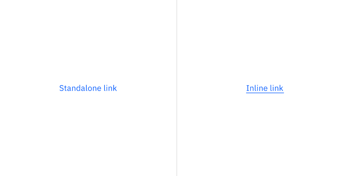
Link
Color
| Element | Property | Color token |
|---|---|---|
| Link | text-color | $link-primary |
Interactive states
| State | Property | Color token |
|---|---|---|
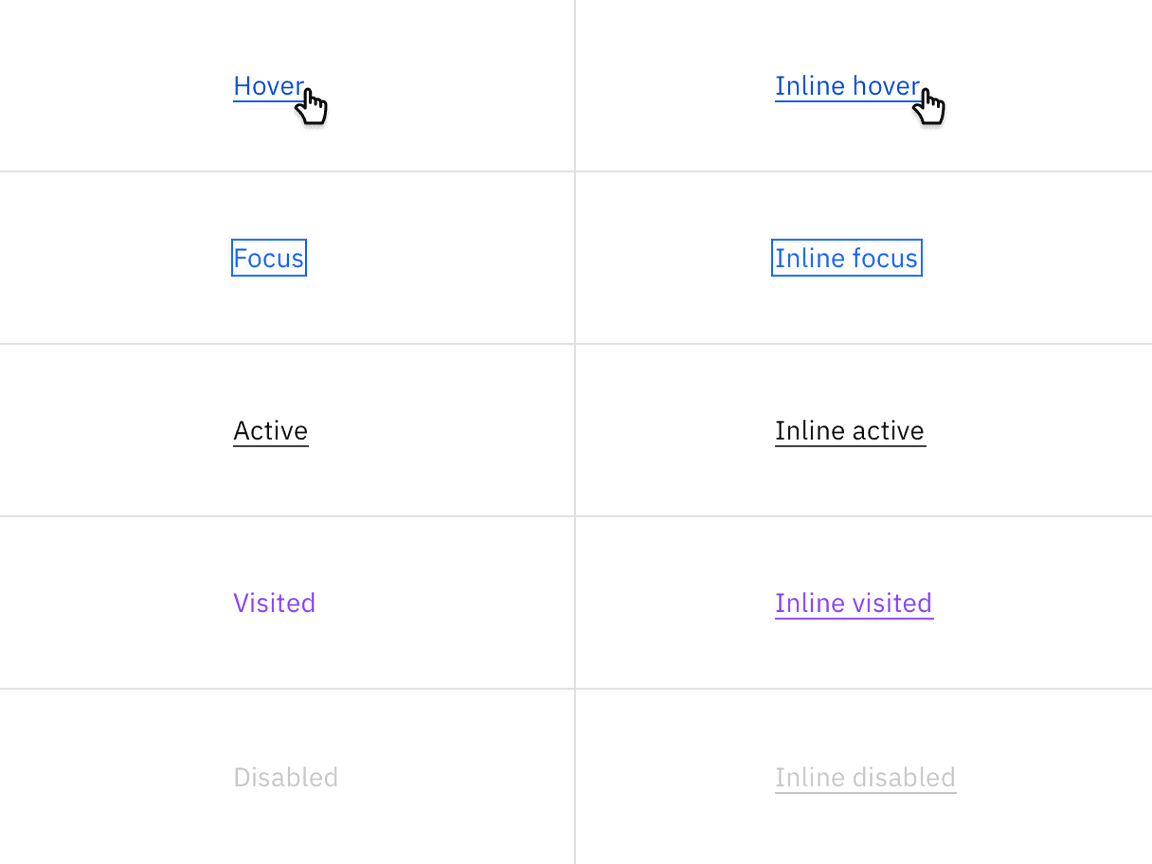
| Hover | text-color | $link-primary-hover |
| Active | text-color | $text-primary |
| Focus | border | $focus |
| Visited | text-color | $link-visited |
| Disabled | text-color | $text-disabled |
Typography
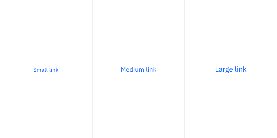
There are three size variants for the link component: small, medium, and large.
| Element | Font-size (px/rem) | Font-weight | Type token |
|---|---|---|---|
| Small | 12 / 0.75 | Regular / 400 | $helper-text-01 |
| Medium | 14 / 0.875 | Regular / 400 | $body-compact-01 |
| Large | 16 / 1 | Regular / 400 | $body-compact-02 |
Structure
Recommended
Links can be grouped horizontally or vertically. The following specs are not built into the link component but are recommended by design as the proper distance between grouped links.
| Element | Property | px / rem | Spacing token |
|---|---|---|---|
| Link | padding-right | 16 / 1 | $spacing-05 |
| padding-bottom | 4 / 0.25 | $spacing-02 | |
| padding-bottom | 8 / 0.5 | $spacing-03 | |
| Icon | padding-left | 8 / 0.5 | $spacing-03 |
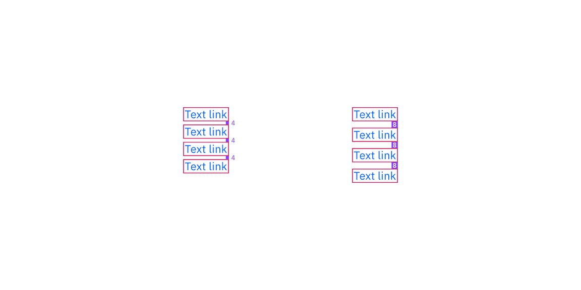
Structure and spacing measurements for Link | px / rem
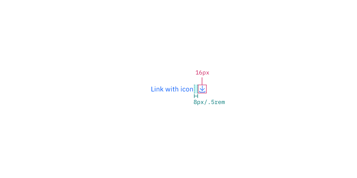
Structure and spacing measurements for Link with icon | px / rem