IBM Commerce Platform
Learn about how the IBM.com team adopted Carbon for the design and development of the new self-service purchase experience on IBM.com.
Overview
The IBM.com Commerce Platform team spent three months transitioning their checkout flow to implement Carbon and improve their conversion rate and overall product experience. They took an iterative approach, starting first with small, isolated features to get comfortable designing and developing with Carbon. Next, they replaced existing elements with Carbon components. Once all the components had been transitioned, the team focused on updating page structures and layouts.
Since the Carbon implementation, the team’s delivery cycle has sped up and they spend less time on quality assurance. Their product is now aligned with the other IBM.com experiences that use Carbon, creating a consistency of experience. Their conversion rate increased by 5% and more than 50% of customers are converting to purchase, which puts them on par with industry benchmarks.
The challenge
Project goals
The IBM.com Commerce Platform team had a mission — to improve the completion rate for their checkout flow. They knew there were usability issues in the checkout process but they also wanted to add new features.
By aligning their checkout flow with the Carbon Design System, they could add new features in a consistent way and make a lot of small improvements, which would have a large impact on the completion rate and therefore revenue.
The team aimed to do this by decreasing clicks, increasing device compatibility, introducing high-value features, and fixing existing bugs. An additional goal was to reduce the amount of time IBM support was spending manually identifying and resolving order issues.
Analytics and research
Site analytics helped identify existing issues in the checkout process. There were key issues to address during the transition to Carbon:
- There was a lack of visual and information hierarchy on the page.
- Critical information was missing when users encountered an error, and this blocked them from moving forward.
- Customers felt the checkout experience was unreliable, and couldn’t quickly find what they wanted, so they abandoned the flow.
Competitors
The Commerce team knew their eCommerce marketplace was falling behind competitors, in both market share and user experience. Competitors had been moving to a more modern experience that used data given by customers to pre-populate fields, which significantly reduced the number of clicks. The team used this project to strategically update their product to be able to better compete in the marketplace.
The proposed solution
Transitioning to Carbon
Implementing Carbon would make the interface more clear, meaning users would no longer get lost in the flow and would be able to find what they needed. It would also align key pages before, during, and after the checkout process, creating a sense of continuity. The team hypothesized that as a result, users would be less likely to defect.
The team mapped out their transition to Carbon, focusing at first on a core set of pages. While implementing Carbon components and aligning to the IBM Design Language, they took the opportunity to reevaluate their typography and illustrations. By improving their type hierarchy and illustrations they hoped to transform a somewhat dry experience to something delightful, while building more confidence and trust in the interface itself.
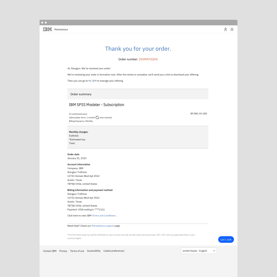
Before: Order confirmation page prior to the redesign.
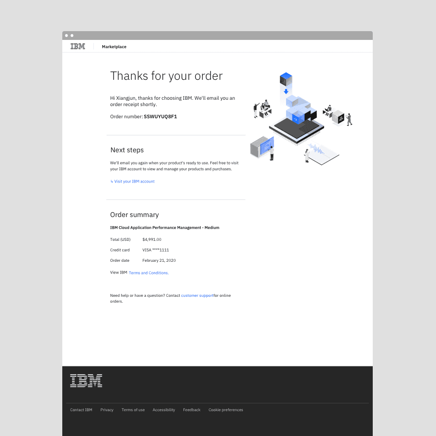
After: Order confirmation page after the redesign.
Identifying high value features
The second part of the solution was identifying high impact features they could implement in tandem with the Carbon transition. Many of these features were self-contained and so they paired well with the overall transition to Carbon, as the team learned to design and develop with the design system.
The global address form was one of these features. The new form validated addresses as users entered them, giving users confidence that they’d input the correct address. Additionally, the support team no longer had to manually follow up on invalid addresses, making the experience better for everyone.
The approach
The transition to Carbon was an iterative process. Rather than updating the entire interface at one time, the Commerce Platform team transitioned their product slowly and tactically. By adopting Carbon iteratively, they were able to see which changes made substantial impacts and use that to inform their roadmap and subsequent changes.
Learning the design system
Before jumping into adopting Carbon, it was important to spend time learning about and getting comfortable with Carbon. Shixie Shi Trofimov, the design lead of the transition project, led the developers through a crash course to align on definitions and terminology. She wanted designers and developers to speak the same language as they worked through a set of design specifications.
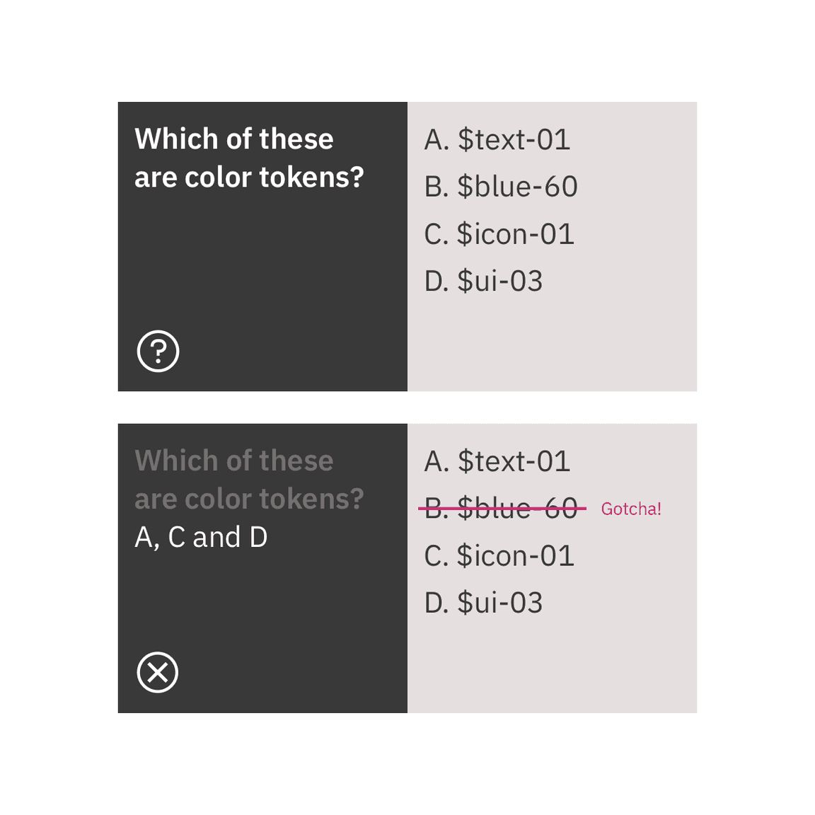
A Carbon token quiz helped get developers comfortable with Carbon token naming conventions.
Starting small
The adoption process started with one modal. Instead of redesigning an existing feature, they identified a high value, self-contained, new feature to develop from scratch. The modal solved an important usability issue by allowing users to change their country during checkout, but it also provided the developers a simple and non-disruptive entry point into adopting Carbon. It also meant they didn’t have to worry about breaking existing functionality in production and had a safe place to experiment and ship.
The process of designing to shipping the modal with Carbon took about a month because it was the team’s first experience with using Carbon and they were getting up to speed.
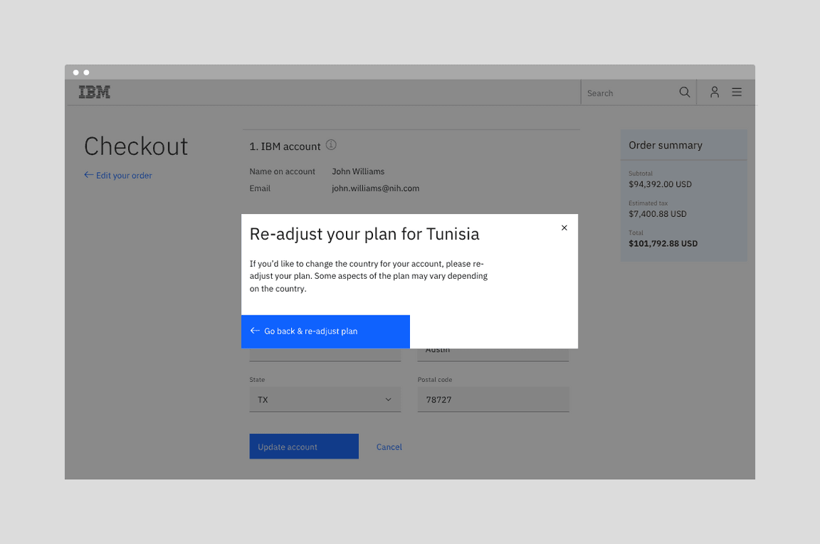
New modal for switching countries
Mixing new with old
The first new Carbon modal was placed on an existing page. It was an easy way for the team to get started and begin shipping new pieces. Mixing new with old wasn’t disruptive for users. Because the changes were implemented in small passes, users may not have even noticed that the experience had changed and returning users did not have to relearn the interface. Also, mixing the experiences meant that got the team to their final result faster.
New modal sitting on the original page
Iterating, iterating, iterating
Rather than updating all of the pages at once, the team took an iterative approach. By starting with fresh features that integrated with the old interface, the team could ship pieces iteratively.
The first stage involved switching individual components to their Carbon version, starting with input fields then buttons. After transitioning the individual components, the page structure and layout was updated.
With this approach, the Commerce team was able to refresh their product’s experience, set the stage for larger future changes, and complete the project in only three months.
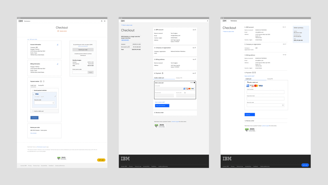
From left to right: The checkout screen in January 2020 before the transition, in April 2020 after the transition, and the future design.
Benefits
There have been several benefits from the transition to Carbon for both the Commerce team’s own workflow and process, and the user experience. The team especially found value in the impact of their delivery speed and need for quality assurance.
Faster delivery
The entire process for implementing Carbon took only three months and since the transition, the team’s development cycle has sped up. By using Carbon, the developers are placing pre-built components and can therefore focus on more important issues instead of taking the time to build out each element and component.
Minimal quality assurance testing
Once the team had been fully onboarded to Carbon, delivery required only minimal quality assurance testing because they were using components straight out of the box.
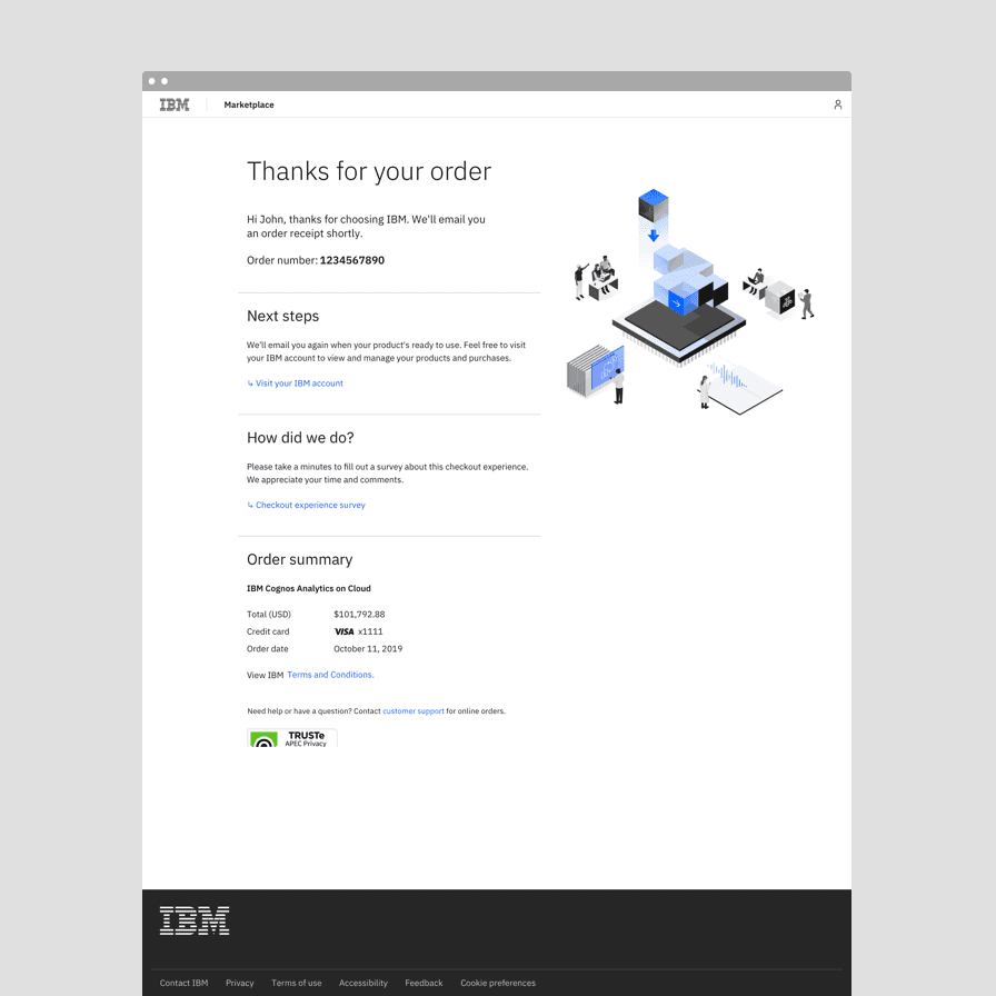
Before: The order confirmation screen design that was handed off to developers.
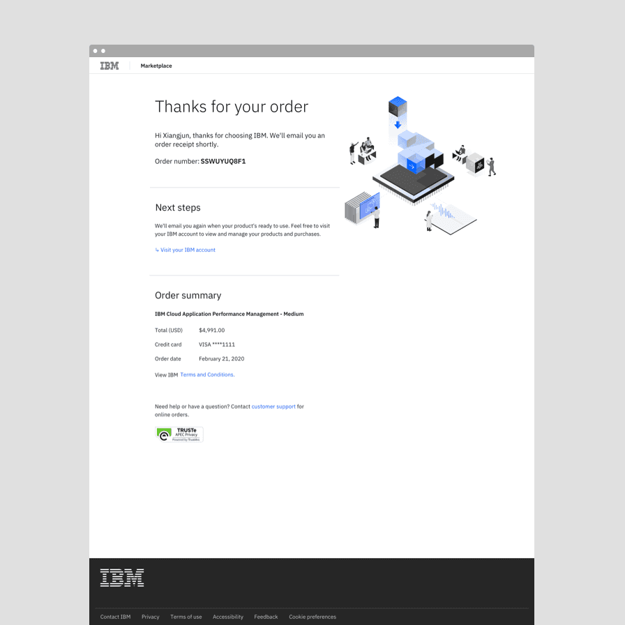
After: The order confirmation screen in production at the end of the sprint.
Continuity in user experience
The project vastly improved the continuity in user experience with other IBM touchpoints, including Support and My IBM. These experiences now feel continuous and intuitive for users.
Within the Commerce Platform flow, pages are also unified and organized in the same way, providing familiarity and a feeling of dependability.
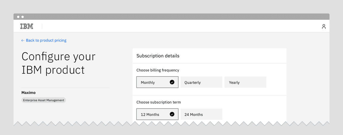
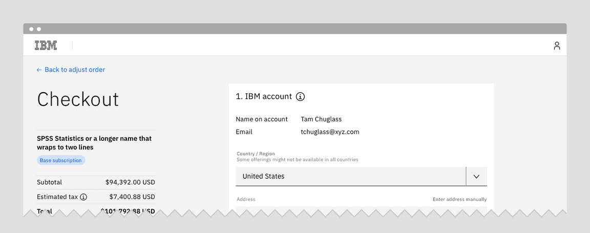
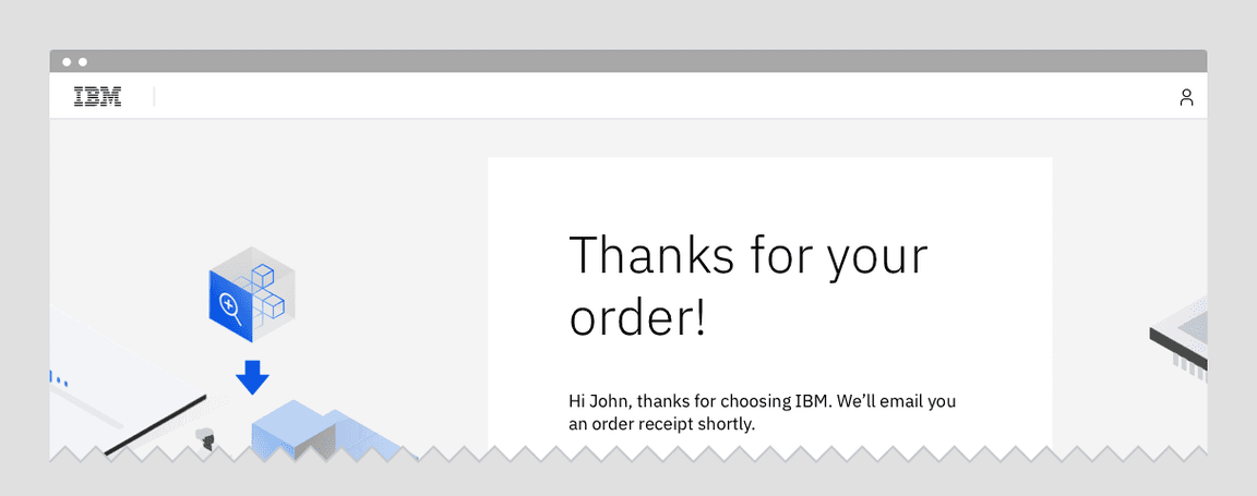
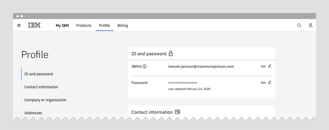
From top to bottom: Product configuration, Checkout, Confirmation, and Profile. These pages illustrate the continuity in experience gained by using Carbon for IBM.com.
Positive outcomes
After the Carbon transition, more than 50% of customers are converting to purchase, which is on par with industry benchmarks. The conversion rate was raised by 5% which has led to a large increase in orders and revenue.
Next steps
The Commerce Team is currently working on improving the experience of their configuration page. The next round of visual design improvements will focus on better aligning their interface with the Carbon for IBM.com style models.