Toggletip
Toggletips display and hide additional information upon the click of a UI trigger element and can contain interactive elements.
What Carbon provides
Carbon already incorporates accessibility into the toggletip component. Designers only need to indicate the toggletip’s content.
Keyboard interactions
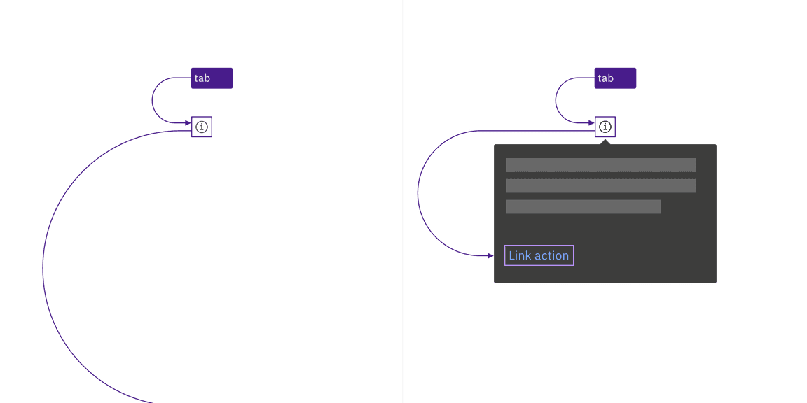
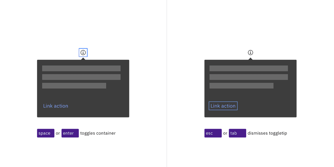
Toggletips use an information icon button for the trigger. These buttons are in
the tab order and are activated by pressing Enter or Space. The activation
toggles the tip open and closed, and focus remains on the trigger.
When the toggletip contains interactive elements, pressingTab will move focus
to the first component in the toggletip. When the toggletip only has
non-interactive text, or when the focus is on the last component in the
toggletip, pressing Tab will close the toggletip and move focus to the next
tab stop on the page. Pressing Esc also closes an open toggletip and returns
focus to the trigger if the focus is inside the tooltip.

The information icon button that triggers the toggletip is in the page tab order, as are interactive elements inside an open toggletip.

Toggletips appear when the information icon button is activated and disappear by activating the icon again, pressing Esc, or tabbing away from the toggletip.
Development considerations
Keep these considerations in mind if you are modifying Carbon or creating a custom component.
- The icon button has
aria-label="Show information". - The button uses
aria-expandedto set toggletip visibility andaria-controlsto handle navigation to the content.