Toggle
No accessibility annotations are needed for toggles, but keep these considerations in mind if you are modifying Carbon or creating a custom component.
What Carbon provides
Carbon bakes keyboard operation into its components, improving the experience of blind users and others who operate via keyboard. Carbon also incorporates other accessibility considerations, some of which are described below.
Keyboard interaction
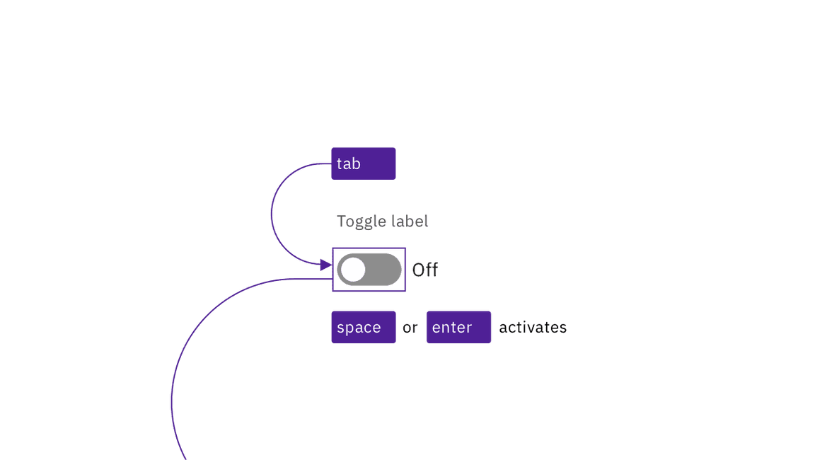
Each toggle is in the tab order. Pressing Enter or Space changes the
toggle’s state between off and on.

Toggles are reached by Tab and activated by Space or Enter keys.
Redundant state information
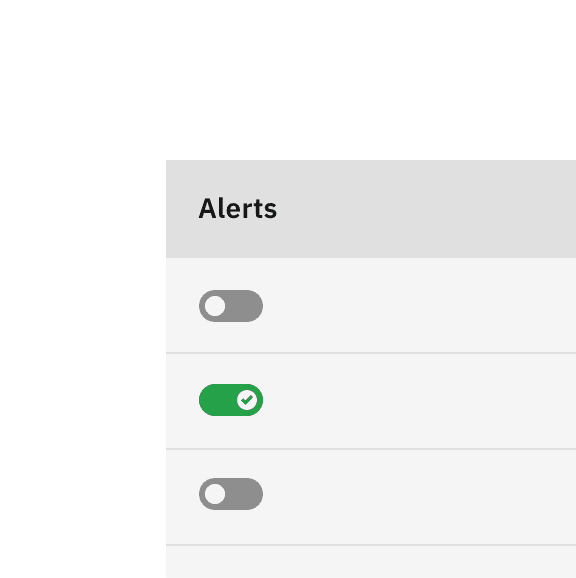
Carbon’s default toggle uses both color and text to indicate on or off. Where space constraints make a smaller toggle desirable, Carbon adds a tickmark to the toggle’s “on” state so that if the text is not included, the component’s on/off state can be distinguished without relying on use of color. The state is also captured programmatically for users who cannot see or understand the visual indicators.

Do include the on/off text for the toggle's state whenever space permits.

Where space is confined, use the tickmark variation in lieu of on/off text.
Design recommendations
Design annotations are not needed, but keep the following point in mind.
Do not change the toggle’s label based on its state
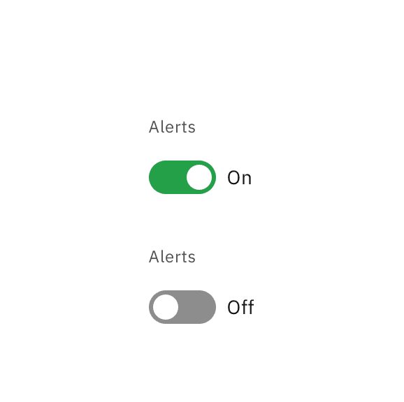
It is essential that designers distinguish between the text indicating the on/off state of the toggle and the text that is the toggle’s label. The label’s text should not change based on the on/off state.

Do keep the label consistent. Only change the state text between On and Off.

Do not change the label text as a way of indicating the toggle's on/off state.
Development considerations
Keep this in mind if you’re modifying Carbon or creating a custom component.
- Toggle is implemented as a button with a role of
switch. - “On” and “off” text is
aria-hidden; the state of the toggle is surfaced witharia-checkedset to “true” or “false”. - The toggle’s
labelis set withfor - See the ARIA authoring practices guidance on switch for more considerations.