Slider
No accessibility annotations are needed for sliders, but keep these considerations in mind if you are modifying Carbon or creating a custom component.
What Carbon provides
Carbon bakes keyboard operation into its components, improving the experience of blind users and others who operate via the keyboard. Carbon incorporates many other accessibility considerations, some of which are described below.
Keyboard interactions (default slider)
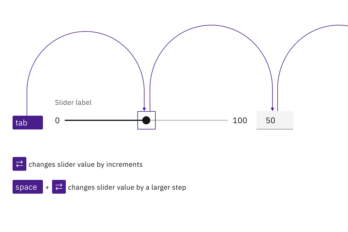
Tab order goes from slider to number input. Arrow keys are used to change the
slider value. Shift + Arrow changes the slider value by a larger increment
(such as by 10 instead of 1). Users can also directly enter a value in the
input.

Both the slider and input are in the tab order and keyboard operable.
Labeling and updates (default slider)

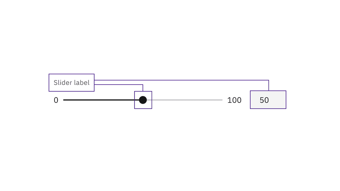
The input value and slider position are in sync. An update to either causes the other to update.
The multiple ways of updating a value within the default slider component.
Keyboard interactions (range slider)
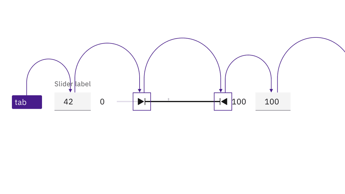
For the range slider, tab order goes from the first number input, to the two handles in turn, and then to the second number input. The handle keyboard operation is the same as with the default slider. Users can also directly enter numbers into the minimum and maximum value inputs.

Both the slider and inputs are in the tab order and keyboard operable.
Labeling and updates (range slider)
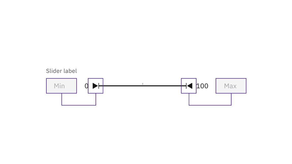
The slider label is a description what kind of values will be selected from the range slider. The minimum and maximum values are labeled with placeholder text of min and max due to space constraints.

The input value and slider position are in sync. An update to either causes the other to update.
The multiple ways of updating a value within the default slider component.
Development considerations
Keep these considerations in mind if you are modifying Carbon or creating a custom component:
- The
stepvalue determines the change increment when moving the slider, either by pointer or keyboard. A value of"1"is recommended. - The
stepMultiplierdetermines the value change when the keyboard is used to alter the slider by pressingShift+ Arrow key. A tenth of the total range is recommended as a value, such as"10"in a 0-100 slider. - See the ARIA authoring practices for more considerations.
Error handling
If an inputted value is outside the allowed range, the slider will auto-correct to the nearest allowed digit. When the inputted value results in an error, the error will display alongside the corresponding text input.
In the range slider, if the inputted value is not logically correct (for example, if a minimum value is greater than the maximum value), a warning message will be generated that informs the user that a value was autocorrected to the nearest allowed digit.