UI shell right panel
No accessibility annotations are needed for the UI shell right panel, but keep these considerations in mind if you are modifying Carbon or creating a custom component.
What Carbon provides
Carbon bakes keyboard operation into its components, improving the experience of blind users and others who operate via the keyboard. Carbon incorporates many other accessibility considerations, some of which are described below.
Keyboard interaction
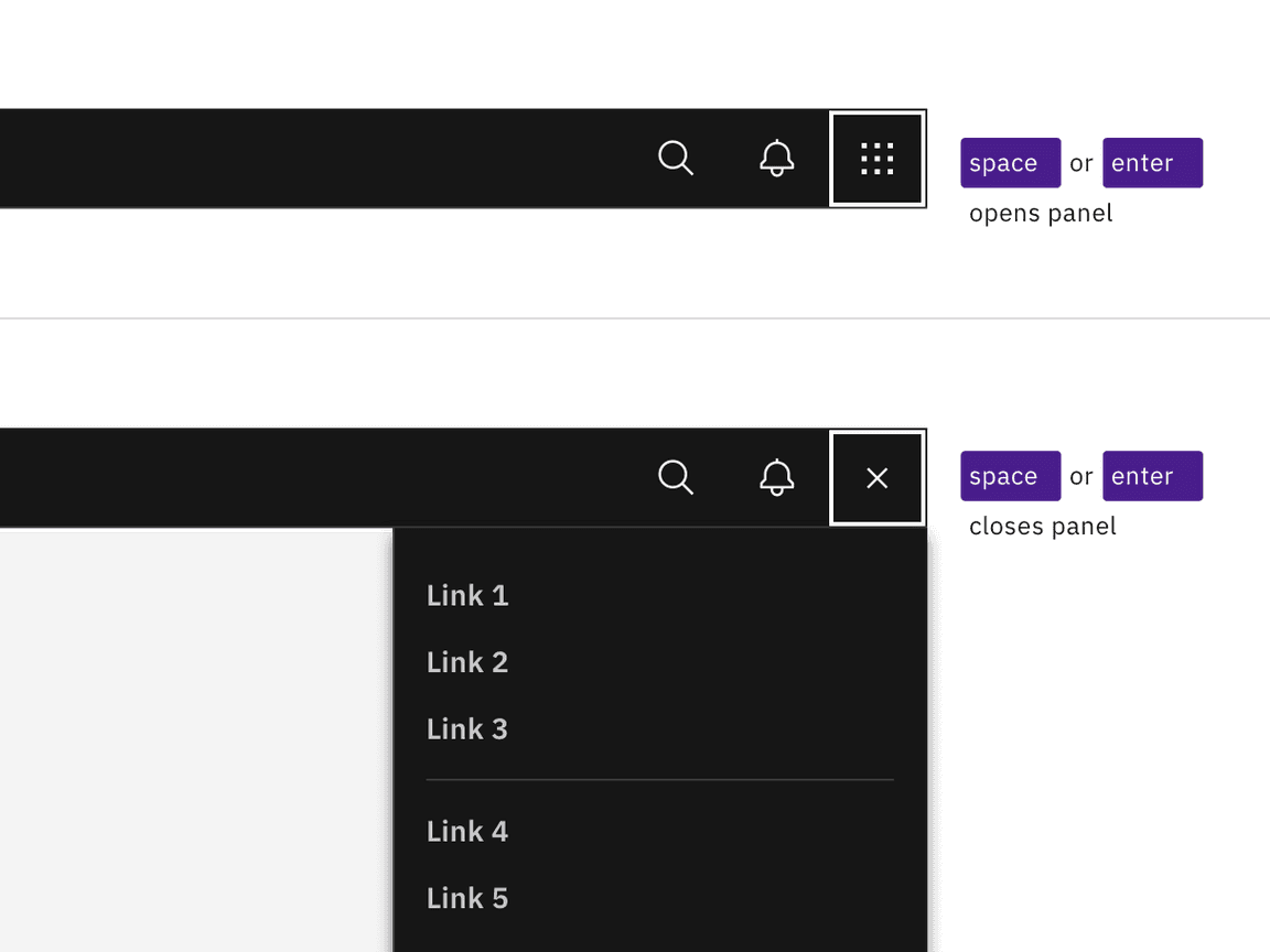
The switcher button is the last item in the UI shell header. Activating the
button (with Space or Enter) opens the right panel over the main content
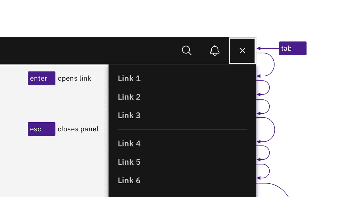
area. All actionable links in the panel can be reached by Tab. Activating any
of the links (with Enter) loads new content and closes the right panel. The
panel can also be closed by pressing Esc or by re-activating the switcher
button (which receives an X icon on activation).

Activating the switch button with Enter or Space toggles the display of the right panel.

Links are reached by Tab and activated by Enter key. Activating links or pressing Esc key closes panel.
Design recommendations
Annotating the switcher button name
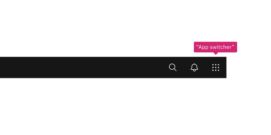
When necessary, designers may need to change the icon-only switcher button’s name to match the right panel’s scope. Depending on the context of the design, common button names include “Switch site” or “App switcher”.

Annotate a name change to the switcher button if needed in your design.
Development considerations
Keep these considerations in mind if you are modifying Carbon or creating a custom component.
- The right panel is in a
<nav>section. - All links in the right panel are in a
<ul>structure, which provides additional information to assistive technologies.